Swinton gets the Kirkstall treatment

Steve Dresser
Founder of Grocery Insight & retail influencer
"The man supermarket CEO's turn to" - BBC"

Last month I was tipped off that a new tranche of lab stores were being launched, with Swinton the first conversion store to receive the new style signage and Produce department.
As Swinton relatively near my base in Bradford I managed to get a trip across the pennines to meet the store management team and also capture the ‘before’ conversion store environment.
 |
| Panorama ‘before’ refit @ Swinton. |
 |
| Panorama ‘after refit’ @Swinton. |
As you can see above, the store at Swinton was a relatively tired post conversion store with mismatched refrigeration units and outdated POS on Produce, the store overtrades despite its difficulties with fixtures and fittings – indeed a hangover from the Safeway days was that the store possessed 3 different shelving types which made planograms difficult to follow and puts pressure on the warehouse (which is tiny!)
As you’ll note from the first visit, the store management team were really looking forward to getting the fresh market experience and also becoming a ‘lab’ in their own right. Its worth pointing out that despite this concept being well embedded in Kirkstall, all stores with the new Produce section are considered lab stores as each trial differs slightly.
Swinton also shows the benefits of project Liberate which is perhaps the most difficult to quantify because without a full range profile (before/after) its hard to pinpoint which ranges were cut back. It is striking though from a before / after perspective how tighter the Grocery range is. Not that there’s a limited choice, rather a more relevant range free of clutter.
The benefits of this are two fold of course, not only does it make the store leaner by focusing on items that sell well but it also makes the warehousing operation more efficient by reducing the range and focusing on a faster moving range of products, aiding replenishment and stock ordering time thus reducing stockholding.
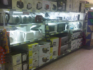 |
| Swintons non food range before refit. |
An illustration of the work that liberate does is before the refit, Swinton only had 2 bays worth of non food stocking a meagre range of household electrical goods, post refit they have a full aisle of homeware and the party goods and partyware range that form part of the new enlarged entertainment range sited by the kiosk.
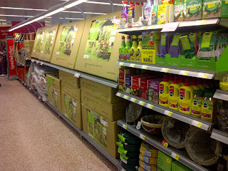 |
| Liberate also gives the store a seasonal aisle for non food items. |
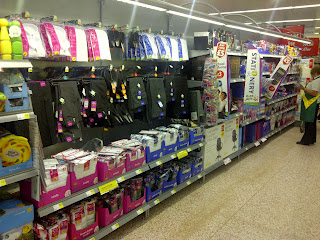 |
| ‘back to school’ is featured at the moment but shortly it will be Christmas lines! |
Naturally Morrisons are not liberating and giving space purely to non food like their rivals with their ‘add space for non food’ strategy, Liberate frees up space for a number of things to give the customer a greater choice in areas like non food, health & beauty and Fresh Produce whilst scaling back on areas like plug in air fresheners and other duplicates in ranges.
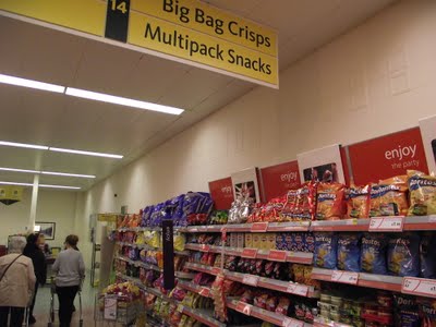 |
| Crisps aisle before refit – note the checkouts at the bottom of the aisle. |
Liberate is not just about shrinking ranges, its all about reclaiming space which obviously leads to a lot of poring over store plans in Hilmore House, as I noted last time – the flower shop is sited where an old backup fridge used to be. Post refit, space has been reclaimed from the checkouts with a ‘corner’ created for household product where some checkouts previously were.
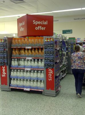 |
| A new ‘corner’ created in store for household and laundry ranges. |
The store hasn’t lost any checkouts, rather abandoning plans for a customer service ‘cube’ and moving the checkouts further up the store to create the extra space. Another key part of both Liberate and Fresh labs seems to be an removal of any clutter both in the aisles and from the roof, the hanging banners displayed ‘price crunch’ galore are notable by their absence in Swinton.
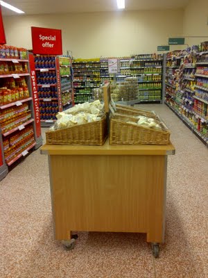 |
| The aisles are free of dumpbins but specialist bakery tables do feature. |
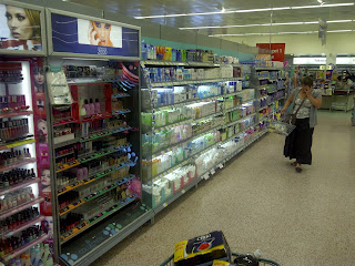 |
| Clear aisles will enhance the customer experience, a common issue in Morrisons is clutter. |
Another change is that the volume gondola ends that feature in so many Morrisons stores, where the product is sold directly from a pallet rather than from shelving are greatly reduced post refit. The store retains fewer volume ends now, this is another shift to focusing on replenishing often but also it aids aisle flow with the central aisle often particularly congested with pallets.
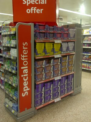 |
| More bulk ends featuring shelving than previous volume pallet based ends. |
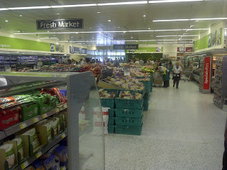 |
| Bar the ‘fresh market’ signage – a total absence of hanging POS. |
Hanging POS is endemic in Morrisons with banners all over the store advertising the price crunch, Disney magic cards and specific offers. In Kirkstall and now Swinton there is a removal of all hanging POS which adds the ‘halo’ effect of the Fresh Market allowing the customer to see right to the back of the store upon entry. The lowered Produce tables, brighter signage and lowered refrigerators also aid this effect.
The lack of dumpbins will not only enhance the customer flow, as aisles look marginally narrower than before the refit, not sure if extra aisles were added in Swinton but stock management will also be easier, especially with dumpbin stock sometimes in different aisles in order to drive impulse purchases.
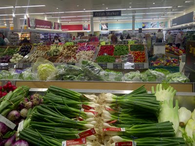 |
| New Produce department with new Market Street signage. |
The one reservation about the Produce roll out was the space it took up in Kirkstall, one of the largest Morrisons stores, the fact that they’ve fit it into Swinton which is a shade over 22000 sq.ft shows there is real scope for this to go nationwide. As we all know, the new Produce department is the main focal point of the fresh lab due to its striking nature, new range and the Vegetables displayed on ice.
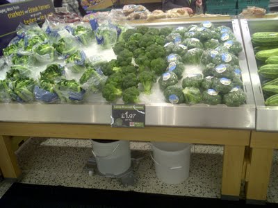 |
| Broccoli displayed on ice, it’s not a gimmick, it actually does keep them fresh! |
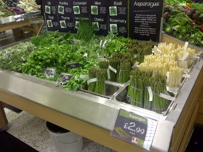 |
| Herbs on an end, these are sprayed regularly with water to keep them fresh. |
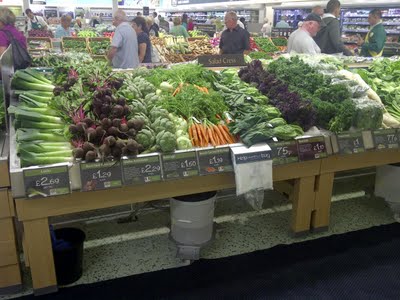 |
| Efficiency is sacrificed for presentation purposes but the results are outstanding in comparison. |
Whilst Swinton only has 6 Produce tables compared to Kirkstalls 10 + space for potatoes, that’s not to say that their range suffers, with 180 new lines coming into the store and flexibility with sales managers amending the range depending on sales and wastage, space isn’t a precursor for Kirkstall to have a broader range than Swinton for example, its flexed dependent on customer demand and sales.
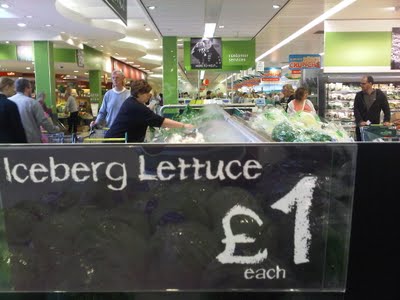 |
| The Hydropipes blowing ‘dry ice’ water onto the Produce to keep it fresh. |
Whilst Swinton doesn’t yet have the hydro pipes spraying water onto the Produce (that looks like steam) like Kirkstall, it is planned to be installed within a week which underlines the commitment that Morrisons have to this. It does keep the Produce fresher and saves a colleague having to manually spray the Produce.
Not only does the smaller Produce department fit the store well, it also answers any questions that were remaining about this being rolled out to smaller stores which does support the assertion that other stores will get the new Produce department and ‘lab’ learnings.
 |
| Premium flowers in Swinton, expected to perform well. |
Its important to note the uplift in the store environment, stores post refit always look in excellent condition considering the attention they get from both the store teams and in expectation of a visit from head office. It’s not just the general refit atmosphere though, subtle changes have been made to enhance the environment post Safeway.
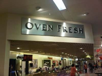 |
| Before – with lower roof over the counters. |
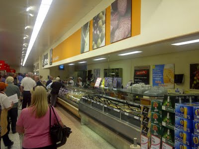 |
| After – with overhanging beam pulled back in line with the signage. |
In addition, it appears the blueprint for these stores is to provide a ‘meal centre’ area for shoppers coming in for their evening meal. All the Produce, Ready Meals, cooked ham and pre cut Deli lines are available in the first ‘third’ of the store. The other half of Fresh Foods featuring Yoghurts, Milk and Juice are on the left of Produce near where Grocery lines typically are sited.
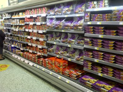 |
| Ready meals near Produce in the first 1/3 of the store. |
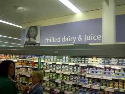 |
| Yoghurt’s and Juice live to the left of Produce into typically grocery territory. |
There is a clear influence from Kirkstall as you’d expect but their ongoing learnings have been rolled out here, for example the overhead signage was yellow / green when Kirkstall was first refitted but then they adopted the green/white bus stops and overhead signage which have been implemented at Swinton.
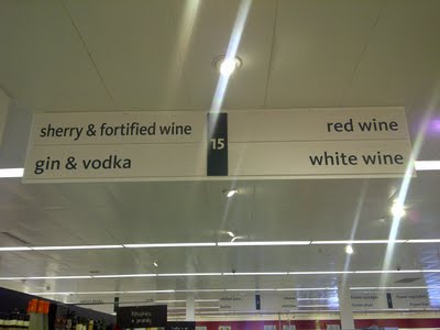 |
| Green/White (Waitrose inspired?) overhead signage in Swinton. |
Not everything has been rolled out though, Kirkstall have had the old Safeway style black/white offer POS with prices ‘chalked’ on the advertising material rather than the current red/white colour scheme. It looks far superior to the relatively dated red/white POS but it’s yet to be introduced into Swinton. Although the Wine department does feature the black/white bus stops.
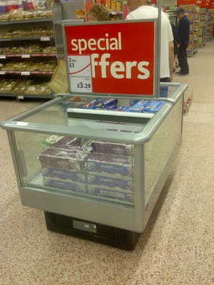 |
| Not many bumblebees left but this one features the old POS – and no overhead! |
A major point of interest in Morrisons at the minute is the Wine aisle, historically Morrisons have won awards and been constantly commended on their excellent choice of Beers and Wines, even harking back to the days of them being a value focused northern retailer. Kirkstall have been trialling a lot of new ideas for displaying wine, trying to drive case purchases of wine for example by pricing by the case as well as the bottle for special offers – no doubt to cash in on the demise of Oddbins for example.
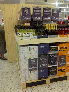 |
| A drive to force customers to purchase by the case rather than just the bottle. |
A major point of difference in Kirkstall is the fact the Wine is now displayed in the wood style ‘wine shop’ display units but recently a move has been made for Wine to appeal to the uneducated masses. Rather than the usual merchandising by region, Kirkstall have changed this to focus on Wine by ‘taste’. Not only does it flip the Wine department thinking on its head, its also had a very positive effect on sales with rumoured huge % sales increases based on the new layout.
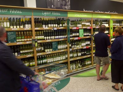 |
| White wine merchandised by taste rather than region in Kirkstall. |
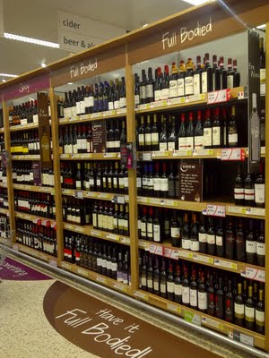 |
| Red Wine divided by taste – Full Bodied, Oaky, Spicy, again in Kirkstall. |
It does clearly sacrifice a measure of efficiency in the early days (like Produce) as replenishing a Wine department isn’t the easiest task with usually only a country of origin to guide you to the right area, with Kirkstall done by taste, it’s particularly difficult. Whether the cases are shipped into store with locations on to aid replenishment or its just down to experience isn’t clear. What’s interesting is that Morrisons appear to be happy to sacrifice levels of ‘efficiency’ for presentation / new ideas to drive growth.
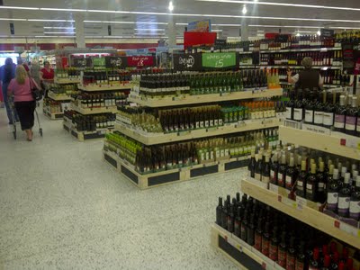 |
| Swinton divide their wine by price and variants – White under £5 for example. |
Swinton adopt the method of utilising floorspace effectively, so rather than have Beers, Wines and Spirits over 3 aisles, they create space by widening the aisles and having units in the middle. Certainly Kirkstall is similar with offers and specialist wines in the middle of the aisle rather than the conventional aisles by aisle layout.
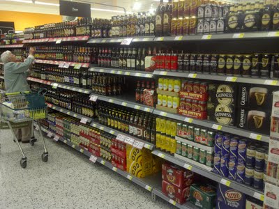 |
| Good range of Beer on the adjacent aisle in Swinton. |
The standard aisles on either side have areas for Rose and Spirits with Beer going across to another aisle to allow for the vast choice of European beers and create clear divisions between Wine / Spirits / Beer.
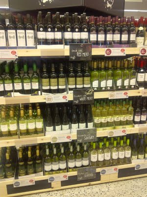 |
| Promotional end with wines merchandised by suitability to certain food rather than half price for example. |
Whereas the Wine special offers used to be sited within the aisle in a special unit, they are now on a specific gondola end and rather sited by specific offer, it appears Morrisons are indicating to shoppers regarding the suitability of wines with food. Understanding perhaps that the vast majority of supermarket shoppers don’t particularly understand Wine and will stick with their tried and tested Hardys / Jacobs Creek for example rather than trying an own label alternative.
You may have the danger of alienating your regular Wine drinker who knows their ‘stuff’ but I’m sure research will have led Morrisons to the hypothesis that your average customer doesn’t know a great deal about Wine and by shaking customers from the merchandising by ‘regionality’ they can hopefully get them try new Wines.
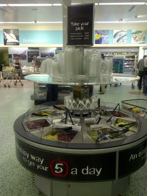 |
| Added to this store is a fruit salad bar – echoes of Safeway…… |
Whilst Morrisons will never reveal their hurdle rates for new stores, or indeed fit out costs for a project like this, its fair to say that not all stores will be able to get the full Kirkstall changes as the cost runs well into the millions and will presumably keep increasing as things are constantly added / changed. That is the beauty of the lab store concept though, trial with confidence and no downturn in trade, if anything the uplift will outweigh any costs incurred on the way, the challenge is to scale the costs to each store and decide what a ‘template’ will contain – stores will get Produce and signage for example rather than a full refit.
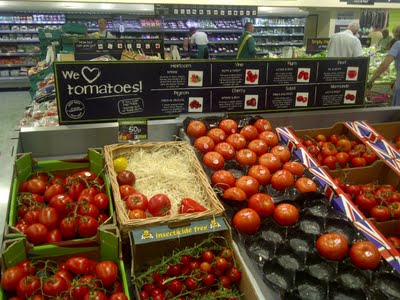 |
| Focus on fresh is never far away – but new signage has costs attached. |
As I mentioned, Swinton haven’t had the full market street refit – there is no 2 hour chicken pledge on the Oven Fresh counter and an absence of the fresh 2 go takeout offer due to space constraints but there have been tweaks to the rest of the store to make it easier to shop.
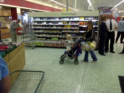 |
| Food 2 go offer is limited to a small fridge unit. |
As part of the CSR pledges to reduce the carbon footprint, Morrisons have been quietly upgrading their refrigerators when refitting stores, Swinton has seen the dynamic of the store change with ready meals and cooked meats / quiches sited in new smaller refrigerators.
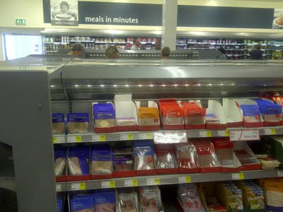 |
| Lowered refrigeration units in contrast to standard ones. |
Not all the refrigeration units have been replaced though, some have been serviced and painted to enable them all to fit in with the store environment, before the refit, Swinton had a patchwork of fridges from different eras and suppliers dotted across the store. Uniformity of one standard colour makes it a far better store environment to shop in, the store is lighter and brighter due to the changes that have been made.
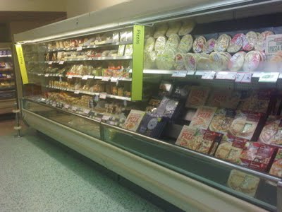 |
| Before – Pizza fridge with biege trim. |
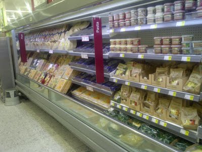 |
| After – fridge with grey trim, all existing and new units are the same colour. |
Those close readers to the blog will note there has been no mention of the customer service ‘cube’ that was planned for Swinton, it looks as though it was scrapped from the plans in favour of the ‘corner’ that was created for household lines with the checkouts moving down the store.
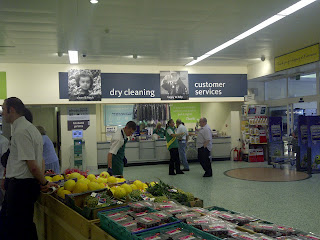 |
| Dry cleaning / customer service signage refresh. |
The customer service desk has been retained in the same ‘hole in the wall’ as you enter the store sharing the space with the dry cleaning department. The new signage for the dry cleaning department appears to be somewhat of a design flaw, it’s all located on the back wall but as the colleague pointed out, that area fills up with clothes that have been dry cleaned whilst they await collection.
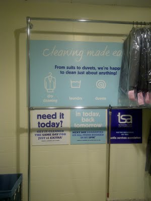 |
| Great promises – ‘need it today for £1 extra’ but it will be hidden by clean garments. |
As I’ve said, Liberate is so much more than creating space for non food, its really quite interesting how much space can be found with smarter ranging, for example increased fresh food space for Produce and Ready meals but Morrisons core non food ranges such as stationery, partyware, cds and dvds have been moved into the area which was previously taken up by just dvds and magazines.
 |
| Previous ‘non food’ department with CDs, DVDs in large units. |
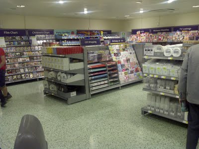 |
| New department featuring more non food ranges and a much of an ‘airy’ space. |
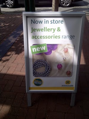 |
| A notable change is the jewellery and accessory gondola end being added to stores. |
So, with the Swinton store now revamped and complete, the finish is somewhat striking compared to the previous guise of the store as an ex Safeway. The store is being backed by an aggressive £5 off money voucher for the next two weeks (spending £30 to qualify) so there will be ample opportunities for the locals to sample what Morrisons has in store, with leaflets going to houses as far as 7 miles away in some cases.
Swinton is definitely ‘different and better than ever’ with a real focus on ‘food’ and an increasing Waitrose style feel with the new signage and lessened clutter in the aisles.
It will be interesting ahead of a possible roll out nationwide but I heard that St Albans is the next existing store to get the updated feel with Shrewsbury the next store to be updated. Obviously Shrewsbury is a lab in its own right with the liberate trial. Then new builds Wrexham and Glasgow (Merchant City) to open with the new fixtures and fittings like Kirkstall.
Next up – Its a visit to Wilmslow for the 2nd convenience opening, it will be interesting to see what changes (if any) have been made post Ilkley.
